Seattle Bouldering Project
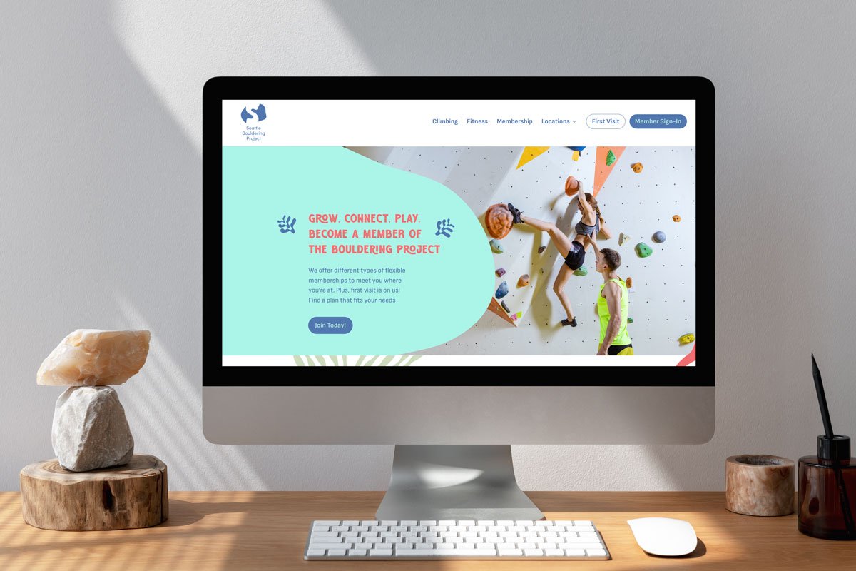
Seattle Bouldering Project is a unique gym that offers comprehensive wellness, not just limited to the act of climbing, but has something for everyone to connect and grow with. Through their diverse program that offers flexible memberships, yoga and fitness classes, nourishment at their in-house café and friendly supportive staff, their gym is a space for many different people.
-
Timeframe: 11 weeks
Collaborators: Solo (research team with Olivia Chasse + Ilona Leclerc Devillard)
Roles: Research, Illustration, Branding, Print Design, Visual Designer
Tools: Photoshop, Illustrator, InDesign, Fresco, Figma -
As Seattle Bouldering Project continues to grow into many communities and different cities, its brand needs to remain versatile and welcoming in their design to connect with many different demographics that interact with their business.
-
As a former member of the Bouldering Project, two pivotal things convinced me it was the right climbing gym to join. BP offered more than just climbing. I could go for a run, attend a yoga class, and end my session with some fun time climbing the walls. BP also was a space I instantly felt comfortable in. The staff members knew me by name and were spirited and supportive. The takeaways from my experience felt important to include in the design direction of the rebrand of the company.
-
SPB serves the Seattle metropolitan area in three neighborhoods, offering patrons the flexibility to select their preferred area. While predominantly attracting a millennial demographic, SPB proactively engages with students and younger generations by providing discounted days and youth incentives. This also draws a family crowd for parents to bring their children. It functions both as an informal social space for casual enjoyment and a consistent venue for individuals who integrate it into their regular routines, whether as a hobbyist or a more dedicated practitioner. Regardless of one's skill level, SPB accommodates both beginners and advanced participants with tailored offerings in their space.
-
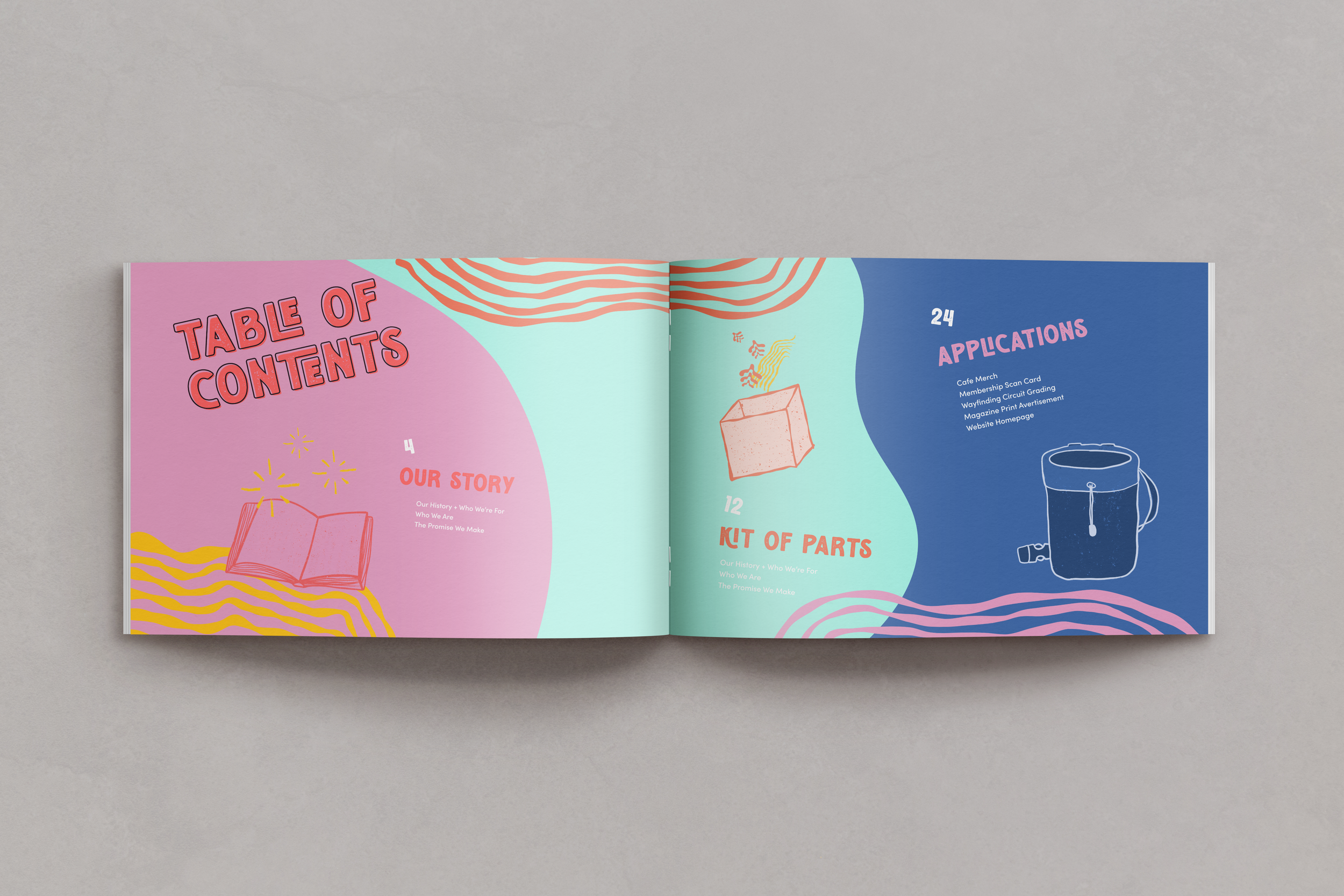
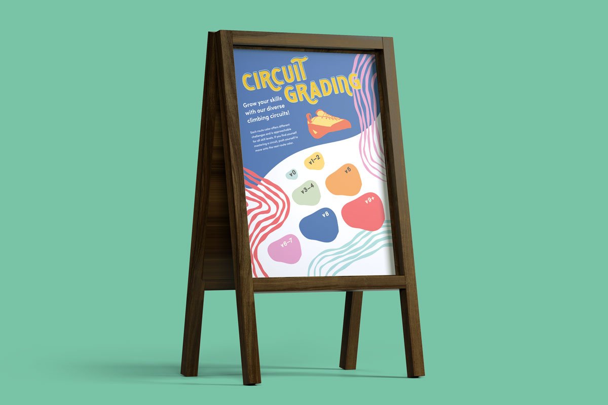
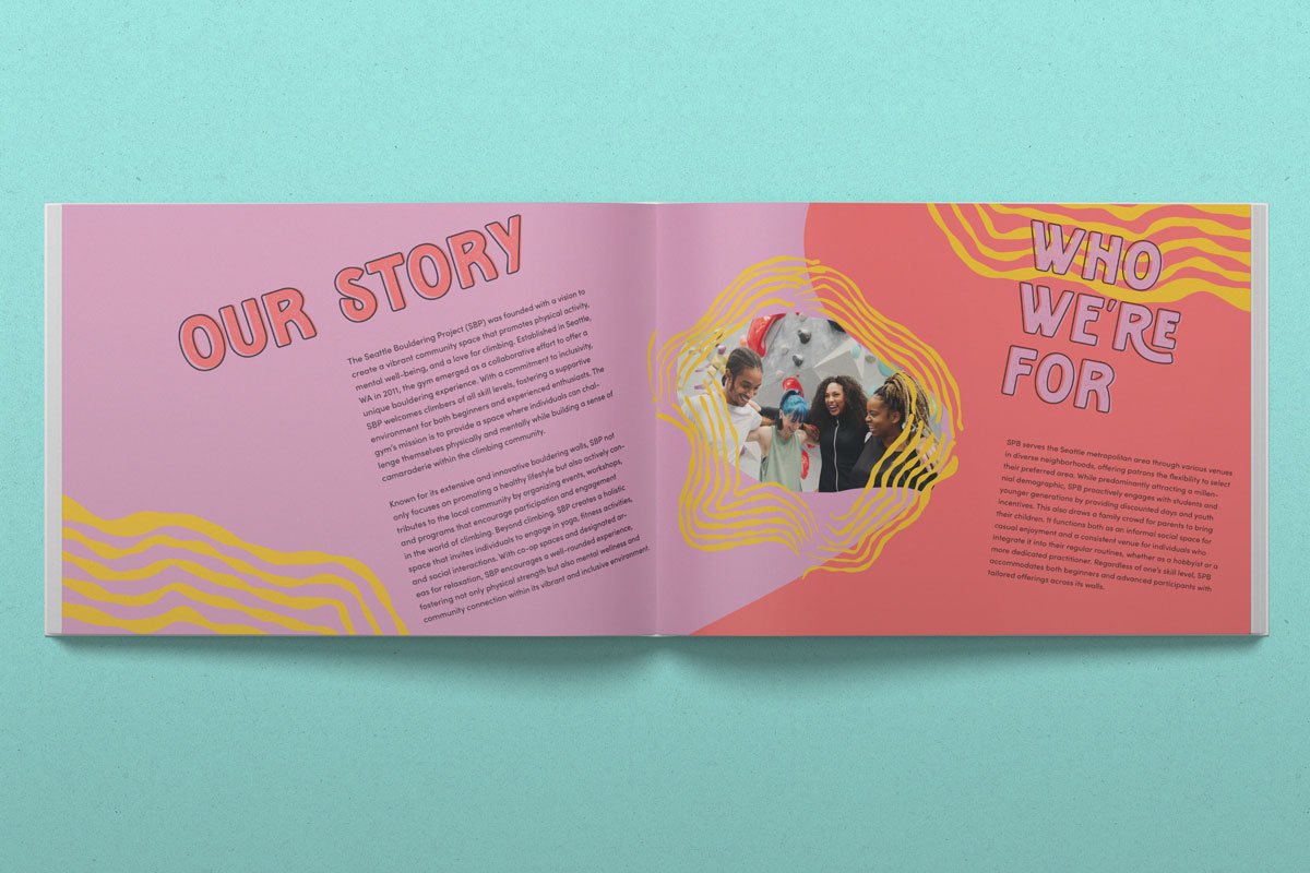
SBP’s driving values are community, accessibility to all skill levels, and encouragement for growth along the way. The final brand design which has a growing library of graphic elements and illustrations is versatile and could be endlessly combined to visually support any activity or offering they provide. Through the use of a bright color palette, expressive and hand-touched typography, encouraging tone of voice, and playful illustrations, this rebrand offers a playful, supportive, and friendly approach for all patrons of the Seattle Bouldering Project.